紀錄練習切版時,遇到卡卡的問題
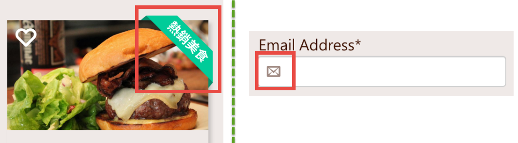
icon 利用 position 位移
示意圖
重點
- row 的 position 設置 relative;
- icon 的 position 設置 absolute;
- 移動 icon 的位置, top 、 left
- 將 icon 移進去在 input 時,input 需增加 左邊padding,保留位置給 icon。
HTML 程式碼
1 |
|
SCSS 程式碼
1 | //記得input的左邊要留padding,保留一些位置給icon |
codepen範例: LoginForm
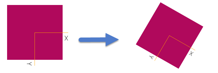
緞帶效果

重點
- .tag-wrap 為 藍色框線
- .tag 為 紅色框線(熱賣)
- .tag-wrap 的 position 設置 absolute ,並且位移要超出原有的框架,才能做出緞帶效果;
- 新增 .tag 的 width、background-color…等屬性
- 利用 transform ,位移翻轉 .tag
- 移動好 .tag 後,在 .tag-wrap 新增 overflow: hidden;, 將多餘的部份隱藏
- 利用 .tag 的偽元素 :before、:after,新增 小三角 ▲
html 程式碼
1 | <div class="card"> |
SCSS 程式碼
1 | .card { |
codepen範例: CSS-緞帶效果(乾淨版本)
codepen範例: CSS-緞帶效果
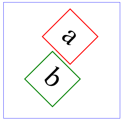
觀念補充
六角範例
本日範例:https://codepen.io/Wcc723/pen/zEYXdN
本日設計參考:https://codepen.io/Wcc723/pen/pWzxXO
transform
CSS 程式碼
1 | /* |
上列 CSS程式碼 「範例1 、 範例2」,
雖然同樣都做了「移動X軸、移動Y軸、旋轉」的動作,
但是因為 執行順序 不同,
所以二個範例呈現出來的結果也會不一樣。
上述程式碼範例: transform_執行順序
transform基本介紹
1.CSS transform 概觀
2.CSS transform 軸線的謊言
3.CSS transform-origin
4.CSS transform-3D的透視
SCSS顏色函數範例
1 | .box{ |
linear-gradient讓顏色有漸層效果
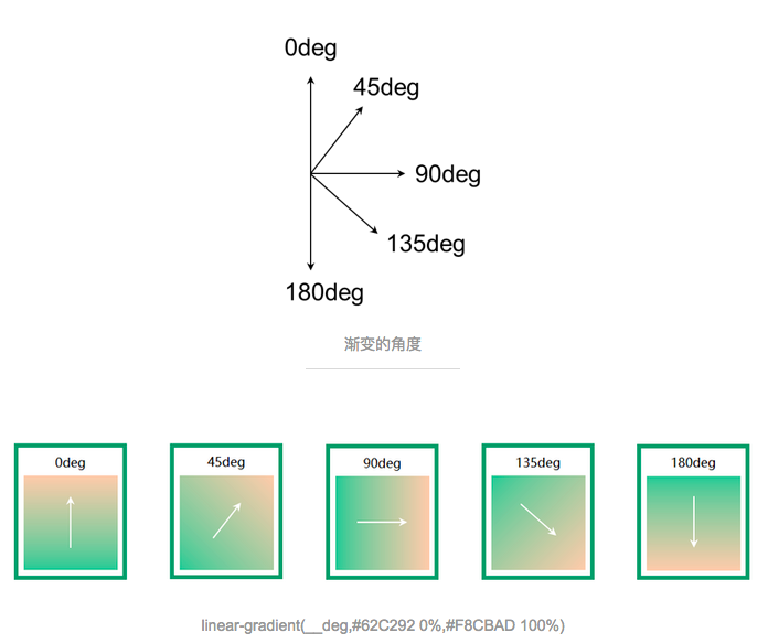
CSS 程式碼
1 | background-image: linear-gradient(165deg, white, white 50%, $bg-color 50%); |
background: linear-gradient( 方向, 第一個顏色, 第二個顏色, … );
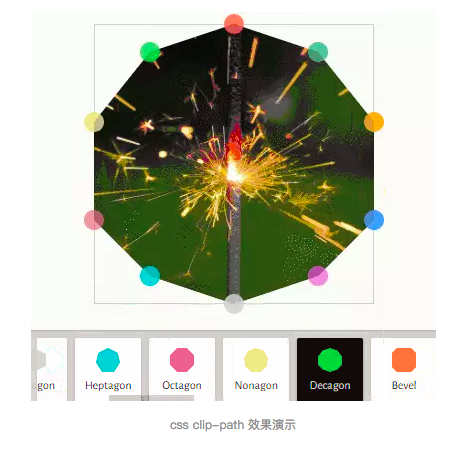
繪製幾何圖形(支援度不高)
1 | clip-path: polygon(0 0, 280px 0, 370px 100%, 0% 100%); |