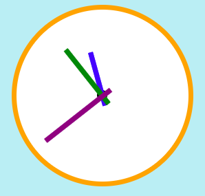
練習-自刻時鐘
步驟
先建立骨架(HTML)
1
2
3
4
5
6
7
8<div class="warp">
<div class="clock">
<div class="centerpoint"></div>
<div class="hour"></div>
<div class="minute"></div>
<div class="second"></div>
</div>
</div>將時鐘元件垂直置中
將「圓點、時針、分針、秒針」移至時鐘的中心點。
1
2
3
4
5
6position: absolute;
top: 0;
bottom: 0;
left: 0;
right: 0;
margin: auto;修改transform-origin與position位置
下列說明以 時針 為例(分針、秒針比照辦理):
垂直置中後的 時針 css
1
2
3
4
5
6
7
8
9
10
11
12
13$handwidth: 7px;
.hour {
width: $handwidth;
height: 80px;
background-color: blue;
position: absolute;
top: 0;
bottom: 0;
left: 0;
right: 0;
margin: auto;
}先修改 transform-origin 的軸心
1
2
3
4
5
6
7
8
9
10
11
12
13.hour {
width: $handwidth;
height: 80px;
background-color: blue;
+ //將軸心變更到 中下方 的位置
+ transform-origin: 50% 80%;
position: absolute;
top: 0;
bottom: 0;
left: 0;
right: 0;
margin: auto;
}加上旋轉的動畫效果
1
2
3
4
5
6
7
8
9
10
11
12
13
14
15
16
17
18
19
20
21.hour {
width: $handwidth;
height: 80px;
background-color: blue;
//將軸心變更到 中下方 的位置
transform-origin: 50% 80%;
position: absolute;
top: 0;
bottom: 0;
left: 0;
right: 0;
margin: auto;
+ animation: time 25s infinite linear;
}
+ //旋轉的動畫效果
+ @keyframes time {
+ to {
+ transform: rotate(360deg);
+ }
+ }修改 position 位置
此時可以開啟Chrome的開發者工具,先利用工具微調好 時針 的position位置,讓他旋轉效果有繞著時鐘的中心點旋轉後,再將程式碼複製貼回去。
1
2
3
4
5
6
7
8
9
10
11
12
13
14
15
16
17
18
19
20
21
22
23.hour {
width: $handwidth;
height: 80px;
background-color: blue;
//將軸心變更到 中下方 的位置
transform-origin: 50% 80%;
position: absolute;
- top: 0;
+ top: -49px;
bottom: 0;
- left: 0;
+ left: -1px;
right: 0;
margin: auto;
animation: time 25s infinite linear;
}
//旋轉的動畫效果
@keyframes time {
to {
transform: rotate(360deg);
}
}